


There's a new blog hop on the street and it's called "Critique This". You may be a little hesitant at first but understand this is such a great opportunity to better your photography. Take nothing that is shared personally.
Here's the low down on what to critique:
- Exposure (is the photo too light or too dark)
- Composition (where are your eyes drawn to, is there negative space)
- Editing (is the photo over-saturated, is the color off)
A few game rules:
- Post one photo
- You can only critique someone else's photo if you are linking up too!
- Be considerate of others when giving feedback
- Link back to Pixel Perfect Blog
Alright here goes.....
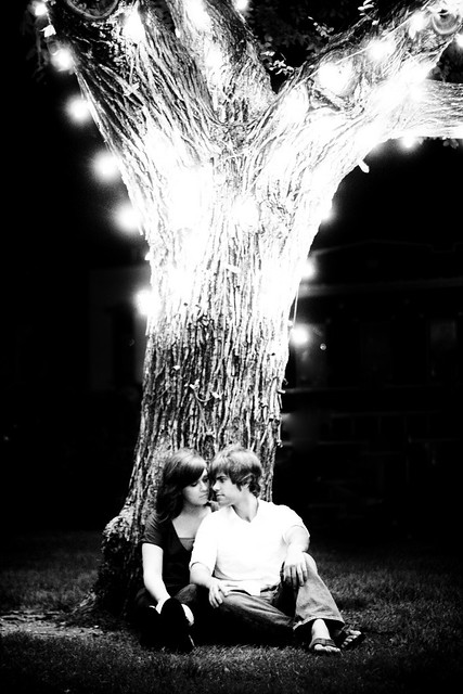
This was taken a few years ago with my canon rebel and 50mm 1.8 lens.


Woops...can you delete entry 1 "Crystal"? Realized a link to Flickr might not be great for feedback. Sorry. Re-entered as "Shine" with a link to my blog. (where's the coffee??)
ReplyDeleteWhat a neat idea since we all have different styles we like.
ReplyDeleteNice photo. I am not sure I can critique though,yikes!
I really love your photo. If it were me I'd probably dial down the contrast a tiny bit just because his shirt sorta blinds me,BUT (and its a big but) I have really really sensitive eyes, as in major photophobia and if the contrast were lower I think that incredible aesthetic quality you have achieved would be gone.
Plus I'm a moron when it comes to photos. LOL
Neat idea!!
ReplyDeleteI really like this shot!! I'm curious as to what it looked like in color. :)It's so unique, I don't even know what else to say! Lovely job. :)
ReplyDeleteI like this idea and I haven't ever seen a picture like this. I think the lights are too blown out in the middle of the tree. I believe if you have a bigger aperture (smaller number for those who may not understand that), the lights don't hit the refracting thing so much and you actually may have stronger detail.
ReplyDeleteI think you foreground is great and you have enough of the tree to make an impression. You could also probably crop about an inch of the top and it would still be a good picture :)
I do really love this shot. I linked up so hopefully I will get good tips...
ReplyDelete@ Haynes- I went to your site and I can't find a place to comment anywhere or e-mail you back! Thanks for your comment.
ReplyDeleteI love the texture of the tree as the back drop.
ReplyDeleteThe whites do seem to be blown out overall, even in his shirt and her arm. Not sure what adjusting the levels in editing would do to the whole photo, but maybe bringing down the whites and bringing up the midtones?
I also love how the circle of light around them on the ground is pretty much perfect.
bek
AWESOME new link-up!!! Can't wait to participate :)
ReplyDeleteFun! How long will this be open? Not sure if I'll be able to get to it today.....And I can't find anything to critique in yours, I love it!
ReplyDeleteI like this shot a lot, but if I had to critique it, I'd say my eyes are drawn more to the lights on the tree than to the couple beneath it. I think maybe a different crop would draw my attention to the couple more. I actually really like the exposure of the couple.
ReplyDelete:)
Thanks for doing this link up! Really, really fun!
I must admit- I'm a bit scared!
ReplyDeleteOH PHOOEY! I didn't realize this had started. Is it going to be every Wednesday???
ReplyDeleteIf someone hasn't done it yet. I can try and make a button. Send me an email sarah at naptimemotog dot com. :)
ReplyDeleteI love this shot, but I agree that the contrast is a little much. I think the brightness of the lights takes away from the couple themselves. I would LOVE to see it in color. Such a fun and unique shot! And I love this new blog-hop! So excited to participate!
ReplyDeleteCrystal- I deleted the first one for you.
ReplyDeleteFlat Yeast Bread- this one is now closed but we will be having this link up again soon! I have yet to announce the next one.
To all the critiques- I agree the lights are blown out. Looking back on it, I should have taken two shots. One where I metered/exposed the lights and one where I metered/exposed the couple. Then I could have layered them in photoshop.
This photo is exquisite!! Absolutely amazing!!
ReplyDelete